When Owen Willis launched Opal Ventures, the vision was clear: build a venture fund for early-stage healthcare founders working to help people live happier, healthier, and more productive lives. Unlike traditional funds, Opal Ventures emphasizes connection as much as capital, recognizing how the right network can help founders navigate healthcare’s unique challenges.
But Opal’s brand and website had not yet caught up to that vision. The original site, which Owen built himself, did not fully communicate Opal’s distinct point of view or the value of its community. Klimt & Design helped turn that DIY foundation into a polished brand system that now attracts stronger inbound interest and resonates with both founders and LPs.
Results at a glance
- Brand refresh that reflects Opal Ventures’ community-driven ethos
- Website redesign in Webflow that communicates the fund’s focus and values
- LP fundraising deck design that uses engaging messaging and visuals to support fundraising
- New quarterly LP update template for more consistent investor communication
- Increase from a couple of inbound founders per month to around 15 per week (30x growth), with stronger founder fit and high-quality inbound conversations
- Positive LP feedback and increased interest in Fund II
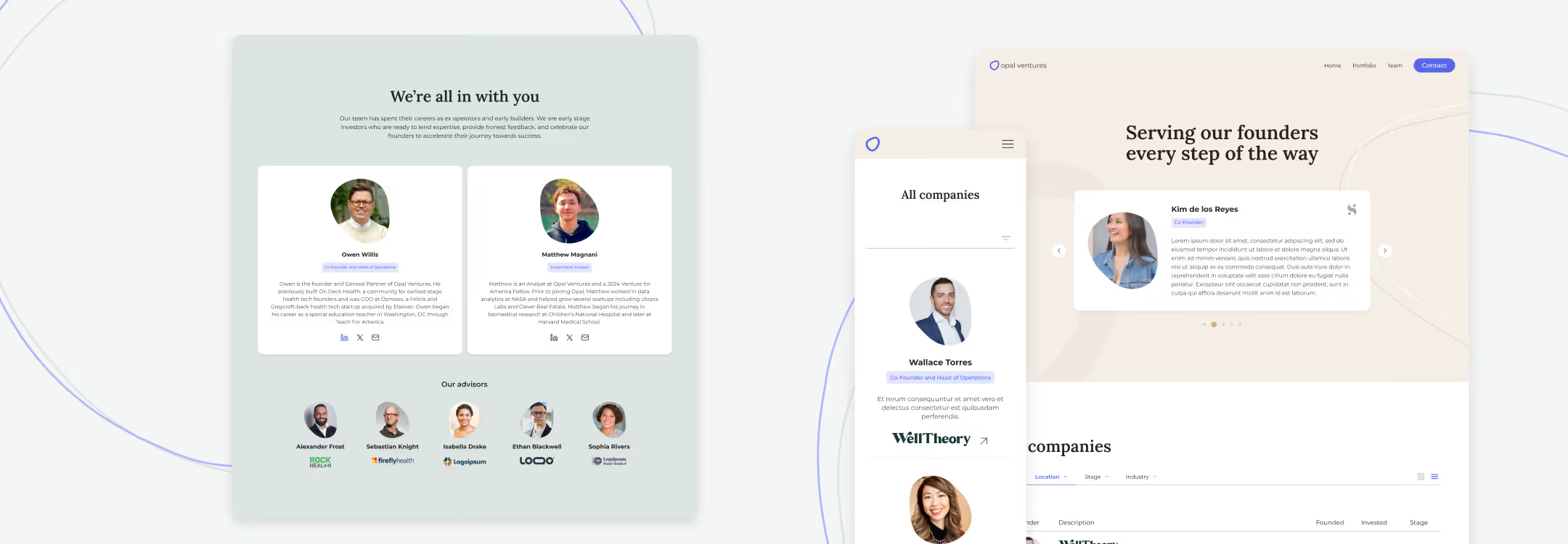
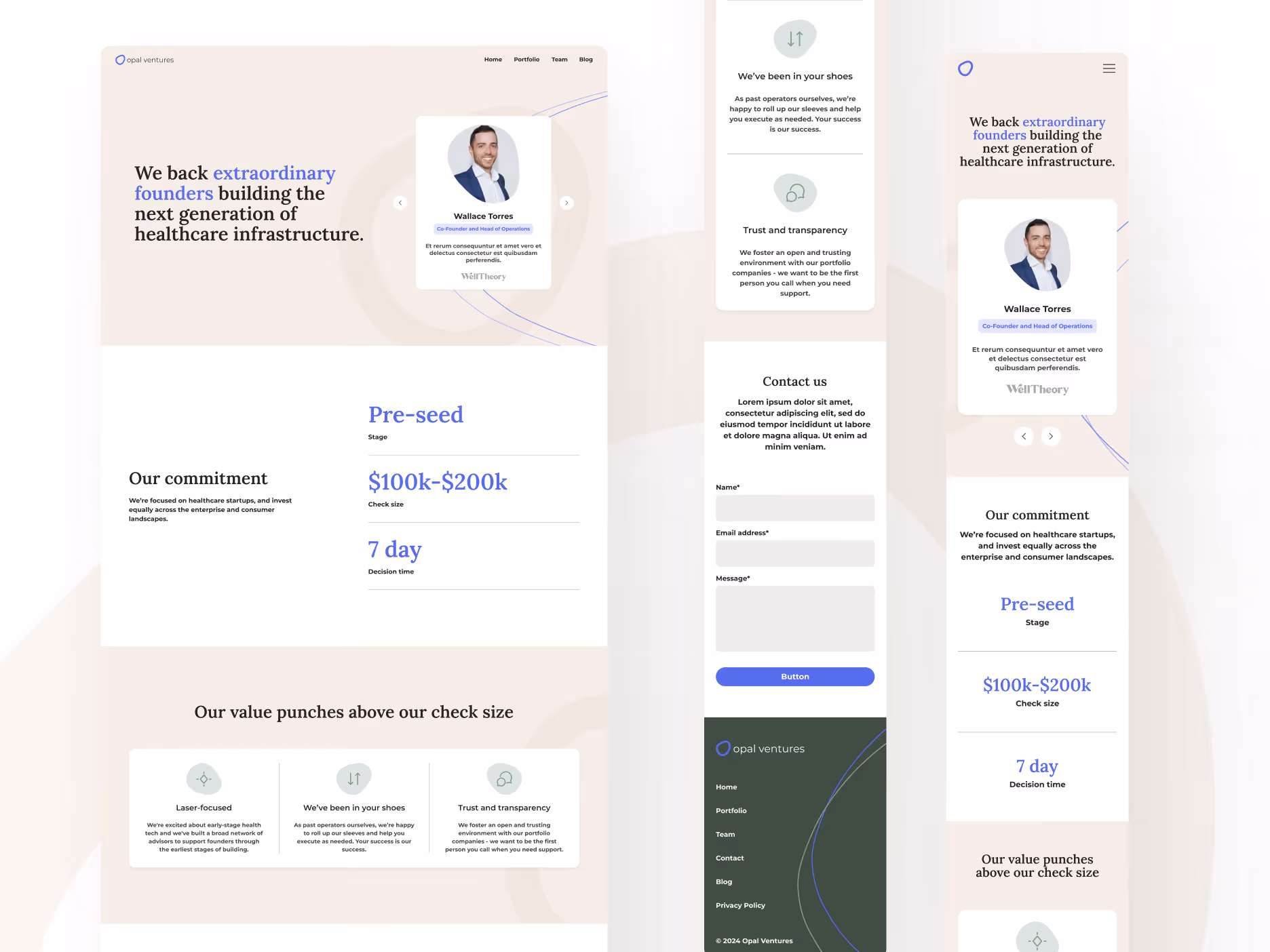
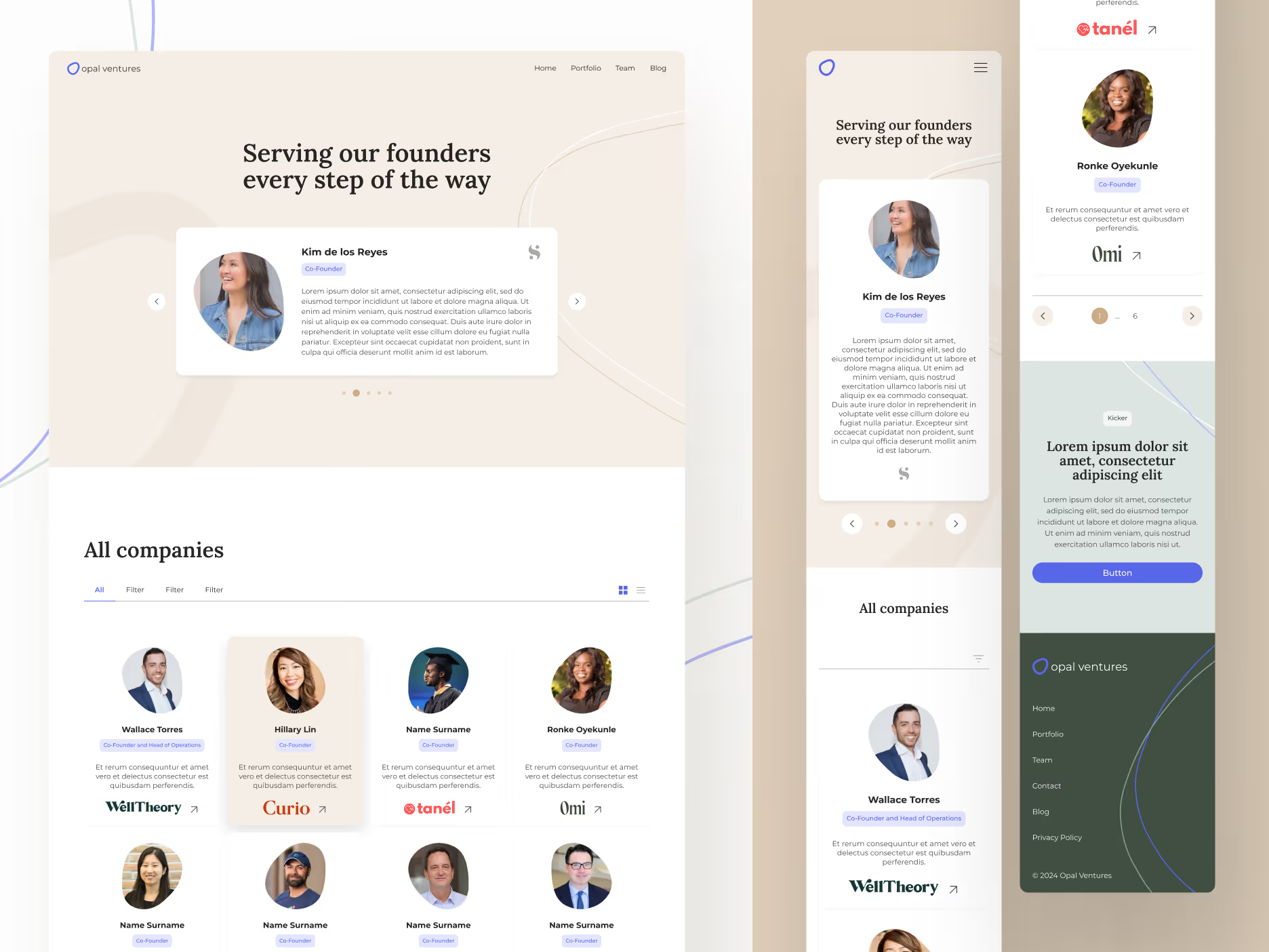
Brand refresh
Landing page design
Webflow development
Deck design
About the project
Opal Ventures needed a brand built for healthcare innovation
Owen built Opal Ventures to address a gap he saw firsthand as a health tech operator and community builder: at the earliest stages, healthcare founders often need investors who can do more than write checks. They need people who can help de-risk the path to growth through on-the-ground expertise. Opal’s deeply relational approach tackles this challenge with Owen’s network of more than 300 founders and healthcare professionals.
Owen had built the original Opal Ventures website himself. While it did the job, it didn’t communicate the fund’s credibility, warmth, or unique ethos. And in a crowded venture landscape (particularly one dominated by sharper, more tech-focused funds), Opal needed a brand presence that felt both more human and intentional.
To give Opal Ventures a brand and digital presence that fully reflected his vision, Owen reached out to Klimt & Design for support in 2023.
The challenge: communicating the value behind community
Opal Ventures didn’t want to look like every other fund, but its differentiation wasn’t clear. In LP conversations, Owen often heard some version of the same hesitation: people didn’t fully understand the strategic value of the network he had built, or they just wanted to wait and see.
Wanting to better convey the value of his community-driven philosophy, Owen needed design support to ensure that Opal’s site, deck, and investor communications could:
- Differentiate the fund from more traditional, transactional venture firms
- Explain its founder-first ethos
- Build trust with both founders and LPs
- Showcase portfolio companies and the people behind them
Klimt & Design’s approach
Opal Ventures partnered with Klimt & Design across several touch points to build a consistent brand with clearer messaging of its network advantage.
Brand identity design
The refreshed identity moved away from generic startup visual language and toward something more distinctive and grounded.
Key decisions included:
- A softer, natural color palette to create a sense of trust, warmth, and approachability
- Organic shapes that suggest growth, flexibility, and human-centered thinking
- A serif-led typographic direction that breaks from the expected VC aesthetic and feels more thoughtful and sophisticated
- Brand guidance that centers imagery around founders and teams rather than abstract illustrations
Together, these choices gave Opal a visual identity that feels differentiated and credible without becoming cold.
Website and landing page design
The website became the clearest expression of Opal Ventures’ story and values. Klimt redesigned the site in Webflow to better communicate:
- Who Opal Ventures is
- What kinds of companies the fund backs
- What the team values
- Why founders and LPs might want to be part of that story
Fund deck and LP communications
Klimt also extended the brand into Opal’s fund deck and quarterly LP update template. These materials help Opal communicate with stakeholders in a more polished way, supporting fundraising efforts while reinforcing the same brand values across every touchpoint.
The outcome: Increased deal flow and sharper messaging
Klimt & Design helped turn Opal’s ethos into a brand identity people could immediately understand: thoughtful, credible, and built around real human relationships. That identity now extends across every part of the brand experience, from the website to investor materials to the way portfolio companies are featured.
In Owen’s words, it now feels like Opal Ventures has “its own corner of the internet that truly represents who we are.”
Beyond helping Opal Ventures feel more fully itself, these changes have also given the fund a stronger foundation for growth.
A credible brand that tells the story of its portfolio
What was once a self-built site became a refined digital experience that better reflects Opal Ventures’ uniquely relational philosophy. In fact, after the redesigned site launched, Owen shared that the first reaction he heard was: “It looks like you work for a real company now.”
The refreshed site also created a more meaningful way to feature the portfolio companies and their founders. Owen noted that founders love seeing themselves represented on the site, sharing, “It’s been great to highlight their companies as part of the story we’re building.”
Stronger inbound founder interest
Before the redesign, Opal might receive only a couple of inbound founders per month through its site. Now, Owen reports the fund sees roughly 15 new founders reaching out every week—roughly 30 times higher.
Even better, the quality of conversation with new founders has improved. Because the website now clearly explains Opal’s focus and values, founders are arriving with a better understanding of the fund’s values and whether there is a fit to work together.
A brand LPs want to associate with
From the LP side, the response has centered on Opal’s new brand appeal, with investors sharing that it feels like something people want to be associated with. The website, deck, and update materials have helped establish the fund as a serious but human-centered presence.
“People say it’s a brand they like associating with. The site communicates that we’re approachable, accessible, and aligned with the values of the people investing in the fund. The website, along with the deck and quarterly updates, has really helped establish the Opal brand, and a lot of that is thanks to the work you and your team did.” –Owen Willis
Looking ahead
With the brand foundation now in place and an even larger network of founders since the fund’s launch, Owen is excited to continue growing Opal Ventures as his team looks ahead to Fund II.
Like Opal Ventures, your brand should make people understand who you are and what you value. If your website, deck, or brand identity doesn’t adequately reflect the spirit of your work, Klimt & Design can help you build something more true to your story. Reach out to learn how we can support your team.


.avif)
%20(1).avif)